Color Psychology in Interior Design: Choosing the Perfect Palette

Color psychology in interior design is a powerful tool that influences mood, behavior, and overall ambiance within a space. By understanding how different hues affect our emotions, homeowners and designers can create environments that are not only visually appealing but also emotionally impactful. This article delves into the principles of color psychology and provides insights on choosing the perfect palette for your home.

The Basics of Color Psychology
Color psychology is the study of how colors influence human behavior and emotions. Different colors can evoke various feelings and reactions, making it essential to choose the right hues for different spaces in your home.
Primary Colors
- Red: Often associated with energy, passion, and excitement. It can stimulate appetite and is commonly used in dining rooms and kitchens.
- Yellow: Represents happiness, warmth, and positivity. It is ideal for kitchens and living rooms to create a cheerful atmosphere.
- Blue: Known for its calming and serene qualities. Blue is perfect for bedrooms and bathrooms to promote relaxation and tranquility.
Secondary Colors
- Green: Symbolizes nature, balance, and harmony. It works well in any room, particularly in spaces where you want to foster a sense of calm and renewal.
- Orange: Conveys enthusiasm, creativity, and warmth. It is great for social spaces like living rooms and playrooms.
- Purple: Associated with luxury, creativity, and calmness. It is often used in bedrooms and living areas to add a touch of sophistication.
Choosing the Perfect Palette
When selecting a color palette for your home, consider the mood you want to create in each room. Here are some tips to help you choose the right colors:
Consider the Room’s Purpose
- Living Room: For a welcoming and social atmosphere, opt for warm colors like yellows, oranges, and reds. These colors encourage conversation and create a cozy environment.
- Bedroom: To promote relaxation and restful sleep, choose cool colors like blues, greens, and purples. These hues help to calm the mind and reduce stress.
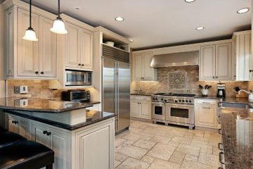
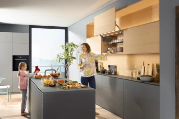
- Kitchen: Bright and energetic colors like yellow and red can stimulate appetite and create a lively cooking space. However, be mindful of the intensity to avoid overwhelming the senses.
- Bathroom: Soft blues and greens are ideal for creating a spa-like, tranquil environment. These colors evoke cleanliness and serenity.
Use Color Properties
- Tint: Adding white to a color creates a tint, which can soften the overall effect and make a room feel larger and more open.
- Shade: Adding black to a color creates a shade, which can add depth and drama to a space. Darker shades are excellent for creating a cozy, intimate atmosphere.
- Tone: Adding gray to a color creates a tone, which can mute the intensity and create a more sophisticated look.
Popular Color Palettes for 2024
Golden Hour Optimism
This palette includes shades of yellow, orange, and buttercream, evoking warmth and positivity. It pairs well with accents of blue and pink, creating a balanced and inviting space.
Shades of Blue
Blue continues to be a popular choice in 2024, with variations from deep navy to soft sky blue. This palette promotes calmness and reliability, making it perfect for bedrooms and bathrooms.
Grounding Tones
Earth-inspired tones like terracotta, clay, and taupe bring a grounding and bohemian aura to interiors. These colors are ideal for creating a cozy and natural environment in living rooms and kitchens.
Green Revival
Shades of green, from deep forest to soft sage, are making a comeback. Green symbolizes renewal and balance, making it a versatile choice for any room.
Tips for Implementing Color Psychology
- Start with a Neutral Base: Use neutral colors like white, beige, or gray as a base and add pops of color through accessories, furniture, and accent walls.
- Test Before Committing: Paint small sections of your walls with different colors to see how they look in various lighting conditions throughout the day.
- Balance Bold Colors: If you choose a bold color for one wall, balance it with neutral or complementary colors to avoid overwhelming the space.
- Consider Natural Light: The amount of natural light a room receives can significantly impact how colors appear. Rooms with plenty of sunlight can handle darker shades, while dimly lit rooms benefit from lighter hues.
Conclusion
Understanding color psychology in interior design allows you to create spaces that are not only beautiful but also emotionally resonant. By carefully selecting colors that align with the desired mood and purpose of each room, you can transform your home into a harmonious and inviting sanctuary. Embrace the power of color and let it guide you in crafting the perfect palette for your home.